Proposal Form Restructuring
redesigned to simplify a long scroll flow
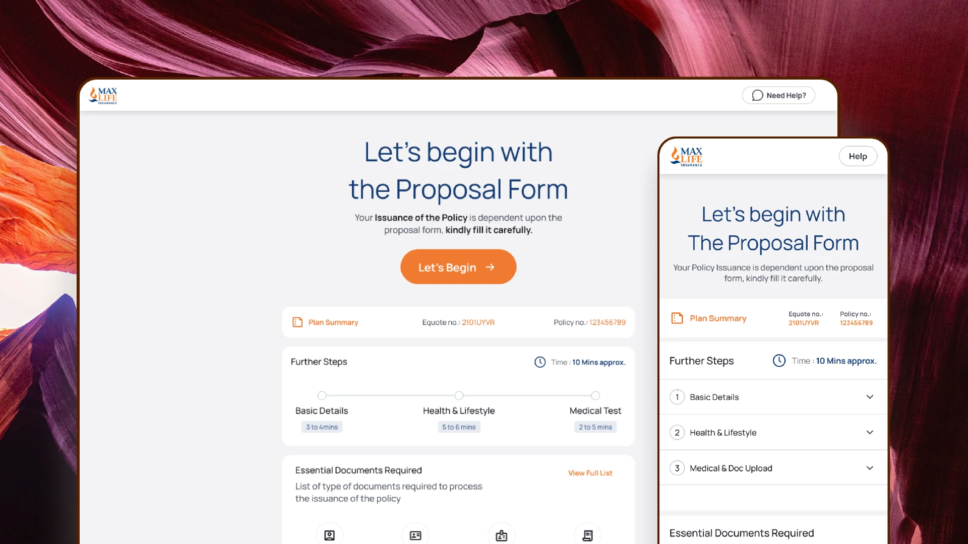
The proposal form journey was redesigned to simplify a previously long, confusing, and error-prone flow. I broke down the existing experience, identified drop-off points (nominee flow, medical questions, KYC, technical declarations), and restructured everything into a cleaner, step-by-step, mobile-first sequence.
Client
Axis Max Life Insurance
Services
Visual Design UI & UX Design
Industries
BFSI (Banking, Financial Services, and Insurance)
Date
September 2024
Key improvements included inline validations, simpler language, progressive disclosure, and dynamic fields that only appeared when needed. This reduced user confusion and made the journey feel more predictable and human.


Cross-team collaboration with underwriting, compliance, operations, and tech ensured accuracy without compromising usability. After multiple prototype tests, the final journey reduced errors, minimized manual verification, and improved the STP rate. Internally, it also cut down operational effort and reduced back-and-forth due to incorrect entries or unclear questions.